razzle dazzle websites
in world war 1, the british and american navy faced a dire problem. their ships were sunk at an alarming rate by devastatingly effective german u-boats. most ships were heavily armed and fortified, but had no means to detect a submarine underwater and no means to attack if they could. all attempts to camouflage the ships had failed as well, due to the vastly different appearances of sea and sky in different conditions.
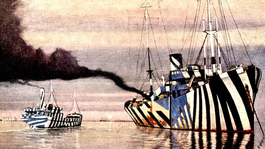
the obvious solution to this was: paint them in bright, loud colors with highly contrasting shapes and stripes. i know, just what you were thinking. but i'm not kidding, look at this:
or this:
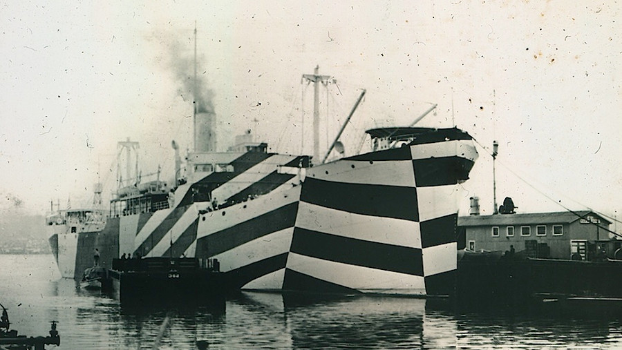
the british navy called this dazzle camouflage, the americans called it razzle dazzle. the idea was if we can't hide an object, we might as well disrupt and confuse the enemy.
what sounds like an obvious joke, was indeed quite successful. torpedoes could only be fired line-of-sight and to hit a moving ship you would not only have to know the target's position, speed and direction, but also chart out where the ship would be by the time the torpedo got there. the margin of error for hitting a ship was quite low, and razzle dazzle could throw off even the most experienced torpedo gunners. a cheap, effective and widely-adopted solution during the great war.
towards the end of the war razzle dazzle camouflage was slowly discontinued due to advances in radar and sonar technology, as well as the increased visibility to aircrafts which became popular then.
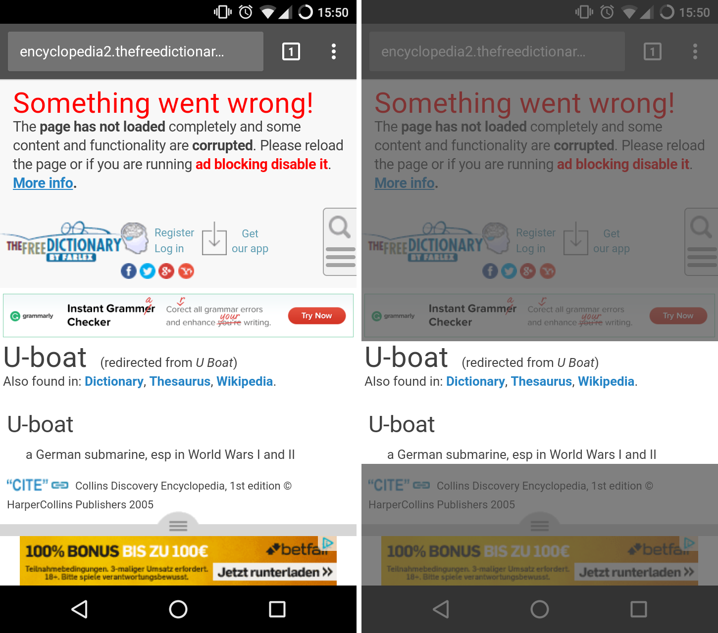
but we still can find razzle dazzle in today's day and age. for me it was yesterday, while visiting this website (i highlighted the actual content on the right):
or this:
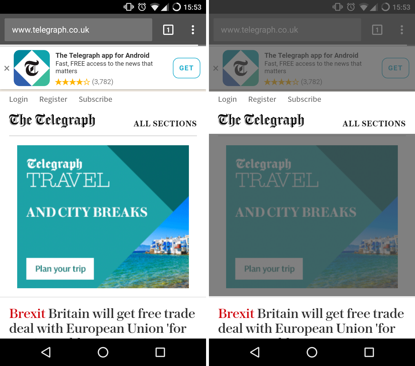
i call these websites razzle dazzle websites.
now you might argue, the main problem here are ads. and i certainly agree, but this also applies to perfectly normal websites without any ads.
here is an example of a previous client of mine, the munich chapter of ixda, an organization dedicated to promoting & coordinating interaction design events as well as serving the local design community.
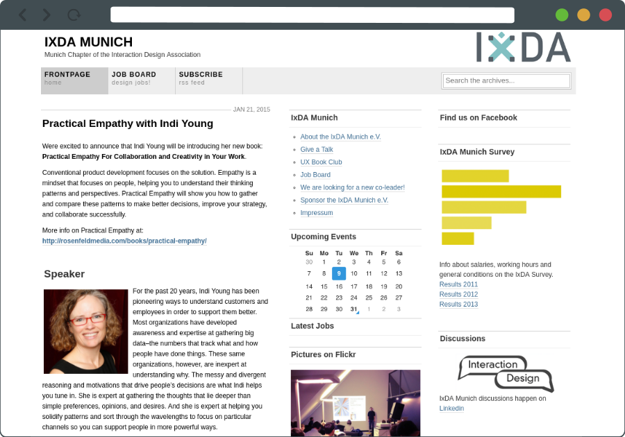
at first glance it might not look that bad, but just count the shear number of possible choices a user could take. do i want to attend the next event (my client's preferred action), or do i want to take part at the survey, oh, design jobs! or i might want to join the discussion group, wait there is a facebook page as well, uhh, how about this great article, shush.. and the photos! look, a three headed monkey behind you!
the primary call to action (attend our next event) is hidden in plain sight. razzle dazzle!
we're not really helping our users to find what they were looking for. in my opinion, all websites should have one and only one call to action and the whole website should support and build up to that. for example:
- attend our next event to learn more about...
- download this cheat sheet to help you solve...
- buy our product/service to get rid of...
- contact us here to...
your website is not about you, it is about how you can help your clients. optimize for that.
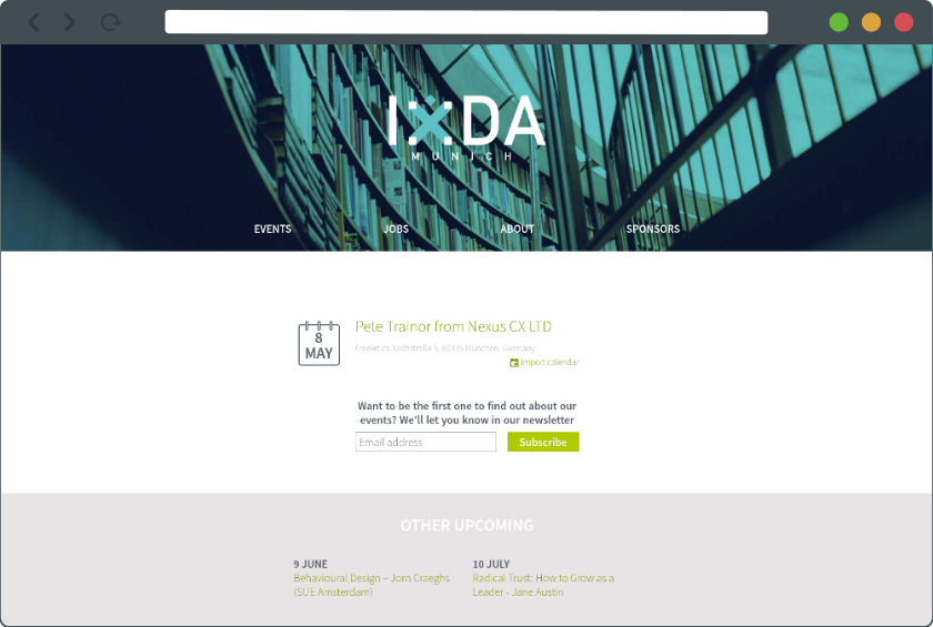
oh, by the way, here is how we redesigned the landing page. i guess it's a bit clearer now.
Want more ideas like this in your inbox?
My letters are about long-lasting, sustainable change that fundamentally amplifies our human capabilities and raises our collective intelligence through generations. Would love to have you on board.