creating beautiful graphics with pgfplots
during the last weeks a lot of people asked me what tools i would use to create graphics for my master thesis. alrighty, i will show you my toolset. to be honest, i am a bit of a design fetishist and therefore i had the following requirements
- consistent font type and size for text and graphics
- high quality, scalable function and data plots, which can be exported to pdf
- shareable configurations and settings between the figures
this basically restricted by options to the awesome pgfplots library, which is built around the even greater tikz library. i won't go into implementation detail here, as you can find more samples and a very good and detailed documentation in the pgfplots manual. anyway, these are three of my latest graphics i needed for my thesis. for a concrete example i filled them with data from the cheese git repository.
the first graphic shows the commit activity of the cheese project from it's first commit until present time. you can certainly see all the hectic during several gnome releases.

the code to produce this plot is the following. i choose to have one tex file for each graphic and convert it to pdf. this allows me to publish the graphics elsewhere too and is generally quite comfortable when using a revision control system such as git. there is of course also the possibility to use tikz external, which generates a pdf file for each figure inside a document on the fly but you might run out of tex memory if your plots get too big or if you have several plots in one document.
basically i just give pgfplots some points in a coordinate system and let it
interpolate the remaining ones. using the dateplot extension, i can use
plain dates instead of numbers and pgfplots will convert them automatically.
\documentclass[class=minimal]{standalone}
\usepackage{mathpazo}
\usepackage{pgfplots}
\definecolor{skyblue1}{rgb}{0.447,0.624,0.812}
\definecolor{scarletred1}{rgb}{0.937,0.161,0.161}
\pgfplotsset{width=12cm,compat=newest}
\usepgfplotslibrary{dateplot}
\begin{document}
\begin{tikzpicture}
\begin{axis}[
  date coordinates in=x,
  x tick label style={/pgf/number format/1000 sep=},
  xticklabel={\year},
  ylabel=Commits,
  xlabel=Time,
  enlargelimits=0.10,
  legend columns=2,
]
\addplot[smooth, no markers, color=skyblue1]
  table [x=date, y index=1] {commits_by_month.dat};
\addplot[smooth, dashed, no markers, color=scarletred1]
  table [x=date, y index=1] {commits_by_month_average.dat};
% both data files are in the following format:
% date commits
% 2011-07-01 77
% 2011-08-01 72
% 2011-09-01 148
% [...]
\legend{Commits, Average}
\end{axis}
\end{tikzpicture}
\end{document}
in my second example i wanted to see at what day/time combination most commits occur. this can simply tell if the development of a project is driven more by a company or by individuals in their spare time. as you can see, most of the cheese development occurs after work or on weekends.
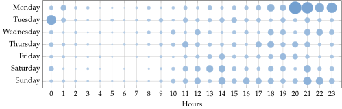
to produce this graphic, i misused the scatterplot extension to draw points
with a calculated size. you can find the related code inside the pre and
post marker code section. using symbolic coords i can use strings as
coordinates on the y axis.
\documentclass[class=minimal]{standalone}
\usepackage{mathpazo}
\usepackage{pgfplots}
\definecolor{skyblue1}{rgb}{0.447,0.624,0.812}
\pgfplotsset{width=12cm,compat=newest}
\begin{document}
\begin{tikzpicture}
\begin{axis}[
  grid=major,
  point meta=explicit,
  xmin=-1,
  xmax=24,
  xlabel=Hours,
  scatter/@pre marker code/.code={%
    \pgfmathparse{\pgfplotspointmetatransformed/1000*50+50}%
    \let\opacity=\pgfmathresult
    \pgfmathparse{\pgfplotspointmetatransformed/1000*7.5+1}%
    \def\markopts{mark=*, color=skyblue1!\opacity,%
    fill=skyblue1!\opacity, mark size=\pgfmathresult}%
    \expandafter\scope\expandafter[\markopts]
  },
  scatter/@post marker code/.code={\endscope},
  symbolic y coords={Sunday,Saturday,Friday,Thursday,Wednesday,Tuesday,Monday},
  xtick = {0,...,23},
  x=0.59cm,
  y=0.59cm,
]
\addplot[only marks,scatter]
  table[x index=0, y index=1, meta index=2] {punchcard.dat};
% data files are in the following format:
% hour day commits
% 00 Monday 14
% 00 Tuesday 42
% 00 Wednesday 14
% 00 Thursday 16
% 00 Friday 12
% 00 Saturday 18
% 00 Sunday 11
% 01 Monday 21
% 01 Tuesday 9
% 01 Wednesday 5
% [...]
\end{axis}
\end{tikzpicture}
\end{document}
last but not least i am interested how involved an author is. it is quite easy to tell the role of a developer by looking at this graphic: does he code more or is he more into project management? when did he enter the project, when did he leave? this are the top six contributors to the cheese project.

the code is quite similar to the first figure, except that i am reading multiple columns out of the same file.
\documentclass[class=minimal]{standalone}
\usepackage{mathpazo}
\usepackage{pgfplots}
\definecolor{butter1}{rgb}{0.988,0.914,0.310}
\definecolor{chocolate1}{rgb}{0.914,0.725,0.431}
\definecolor{chameleon1}{rgb}{0.541,0.886,0.204}
\definecolor{skyblue1}{rgb}{0.447,0.624,0.812}
\definecolor{plum1}{rgb}{0.678,0.498,0.659}
\definecolor{scarletred1}{rgb}{0.937,0.161,0.161}
\pgfplotsset{width=12cm,compat=newest}
\usepgfplotslibrary{dateplot}
\begin{document}
\begin{tikzpicture}
\begin{axis}[
  date coordinates in=x,
  x tick label style={/pgf/number format/1000 sep=},
  xticklabel={\year},
  ylabel=Commits,
  xlabel=Time,
  ymin=0,
  legend columns=3,
]
\addplot[smooth, color=skyblue1]
  table [x=date, y index=1] {commits_by_author.dat};
\addplot[smooth, color=chameleon1]
  table [x=date, y index=2] {commits_by_author.dat};
\addplot[smooth, color=butter1]
  table [x=date, y index=3] {commits_by_author.dat};
\addplot[smooth, color=chocolate1]
  table [x=date, y index=4] {commits_by_author.dat};
\addplot[smooth, color=plum1]
  table [x=date, y index=5] {commits_by_author.dat};
\addplot[smooth, color=scarletred1]
  table [x=date, y index=6] {commits_by_author.dat};
% data files are in the following format:
% hour day commits
% date committer1 committer2 committer3 committer4 committer5 committer6
% 2010-06-01 8 0 34 0 0 0
% 2010-07-01 46 8 52 0 0 0
% 2010-08-01 26 3 18 0 0 0
% [...]
\legend{Daniel G. Siegel, Filippo Argiolas,
  Yuvaraj Pandian T, Jaap A. Haitsma,
  Bastien Nocera, David King}
\end{axis}
\end{tikzpicture}
\end{document}
that's it for now! if you need to produce high quality graphics for your next thesis, paper or just for fun, take the time to have a look at pgfplots. the results are worth it!
Want more ideas like this in your inbox?
My letters are about long-lasting, sustainable change that fundamentally amplifies our human capabilities and raises our collective intelligence through generations. Would love to have you on board.